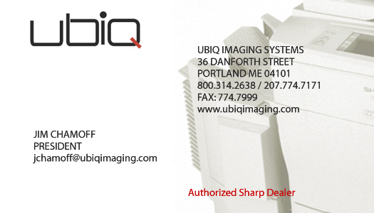
BRAND IDENTITY | PRINT
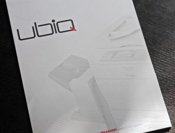
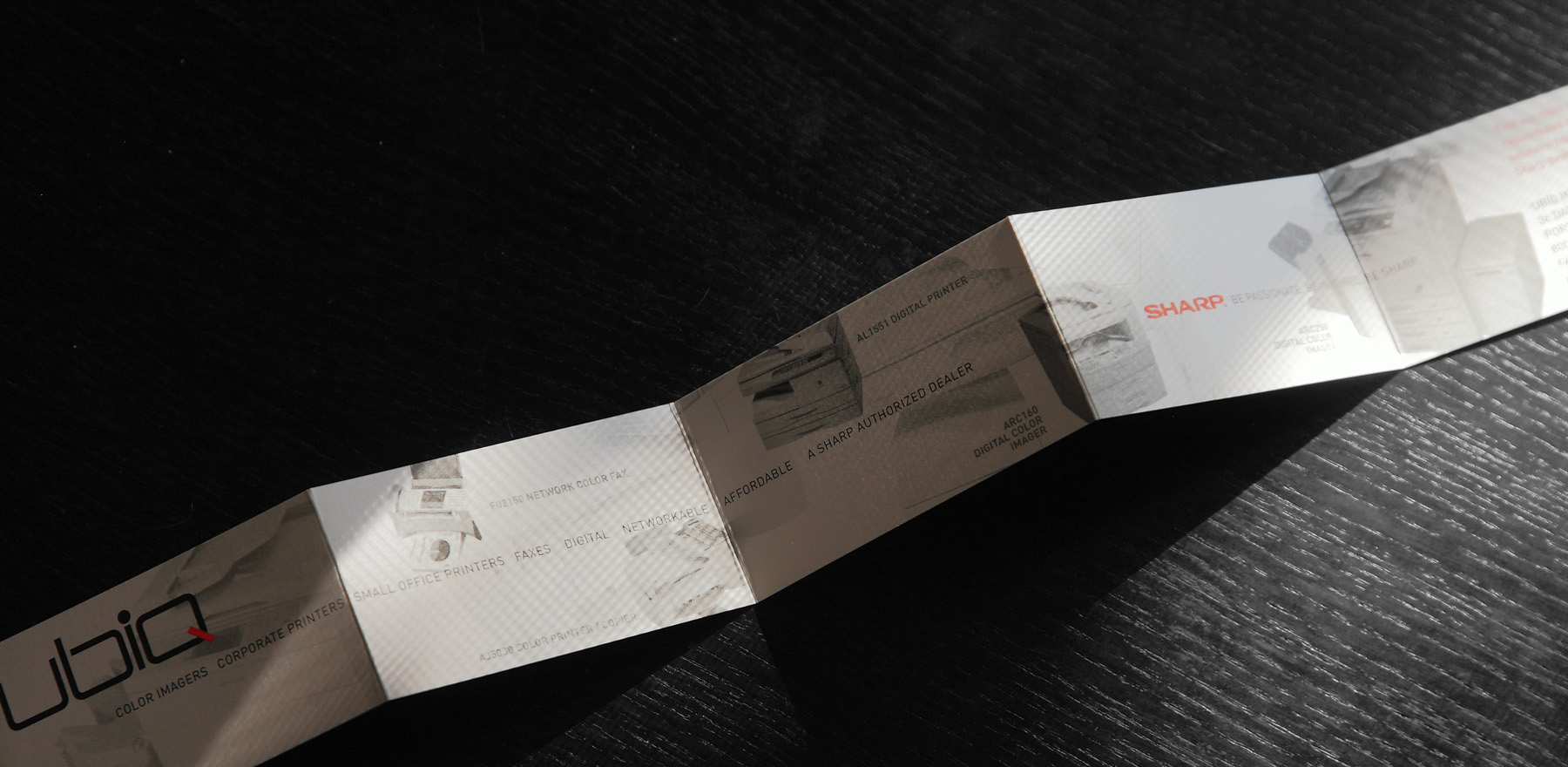
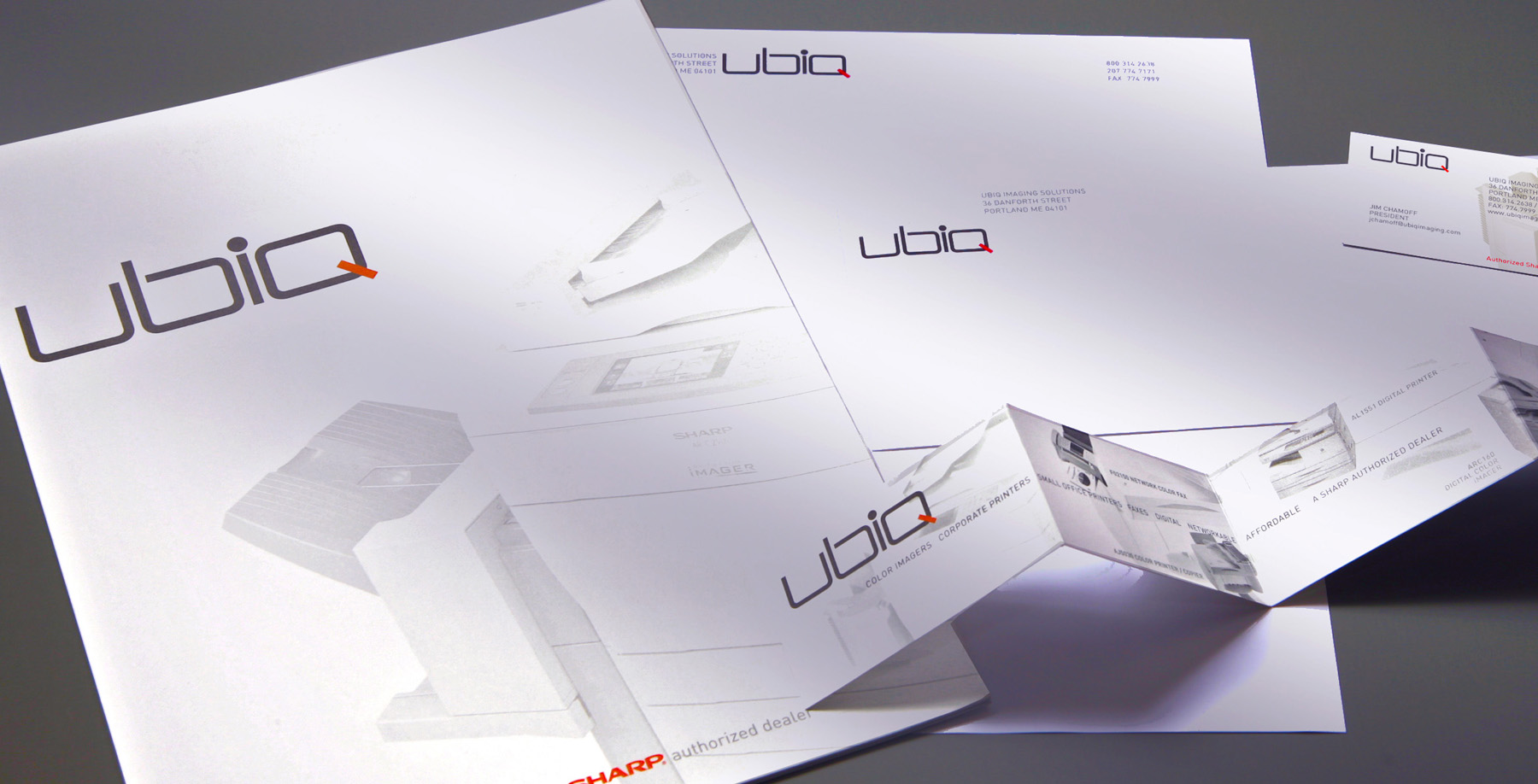
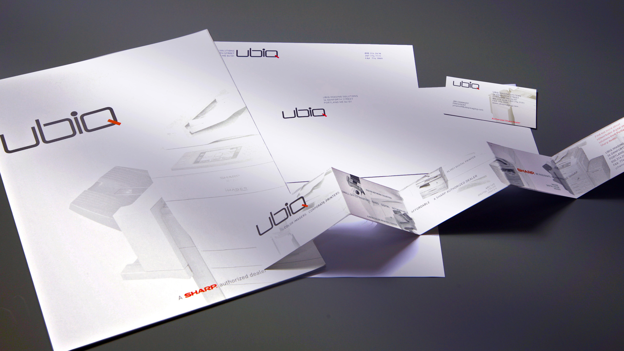
Crisp, clean, white and off-white scheme reflects the color tonality of the physical product (and the paper these products print on). The overall lightness provides two important levels of contrast. First, it allows the black and red logo to dominate. Second, this program practically leaps at the viewer when placed on a desktop with the competition's literature. (A survey of competitive literature revealed a uniform vernacular of busy, oversaturated color that made all other companies look identical.) Rhymes with 'cubic.'
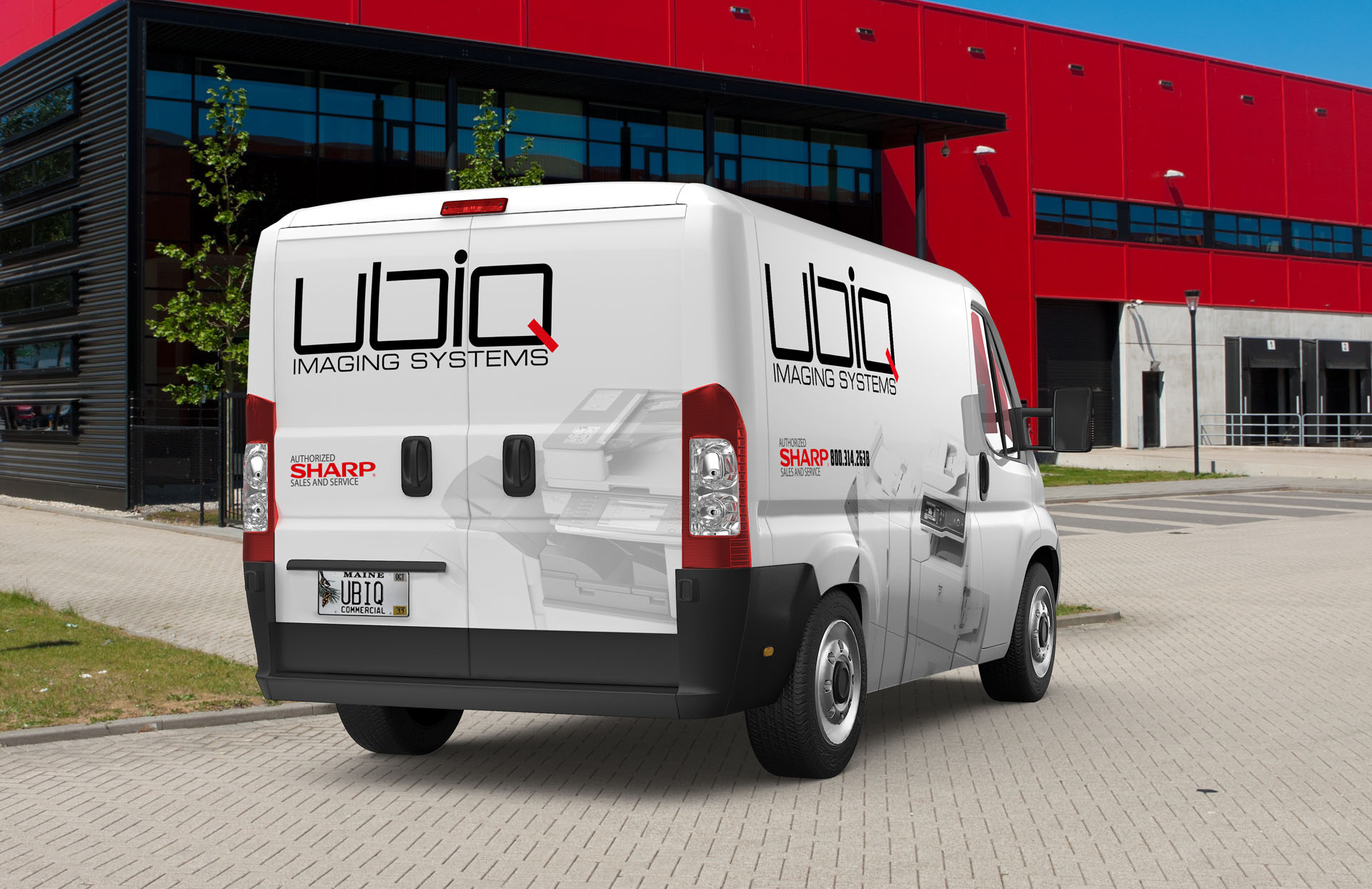
Brand Identity / Logo | Print Collateral | Print Production | Vehicle Graphics | PBS 15 Sec Video Spot